
Late last year, we started the process of redesigning our blog and rolled out a total revamp in December. Here's the new Flutterwave blog. The blog is a crucial part of our web presence and we believe readers ought to get a great reading experience. A couple of important things we were trying to achieve with the blog redesign were:
Better presentation of content
Different reading modes
Standardizing our article feature images
Having a page outline on the article page
Nice micro-interactions and transitions
The goal was to make it an experience, to design something beautiful, functional, and timeless.
Better presentation of content
The experience a reader gets on a blog has a lot to do with how content is structured and relayed. Something we were keen on is relaying information in a very neat manner. We tried to declutter our home page so only important information is displayed. We also greatly used white space to enhance readability by making the website look simple and uncluttered. This way, we are able to deliver information to our readers without distractions. Also, something important we did was to have the latest post styled a bit differently at the top of the home page, this way, we’re able to draw a reader’s attention to this latest article when you land on the page.

Different background themes
Something interesting we thought about during our design iterations, was to have different background themes. We believe having different colour scheme options personalizes the reading experience for people. So we experimented with a couple of nice colour schemes. We later discovered some colour schemes didn’t sit well with the entire site and also in an attempt to avoid overloading the reader with many colour variations, we settled with three background themes. A dark mode (because why not? it’s so beautiful), light mode, and a sunset/banana mode(which is still a light mode).

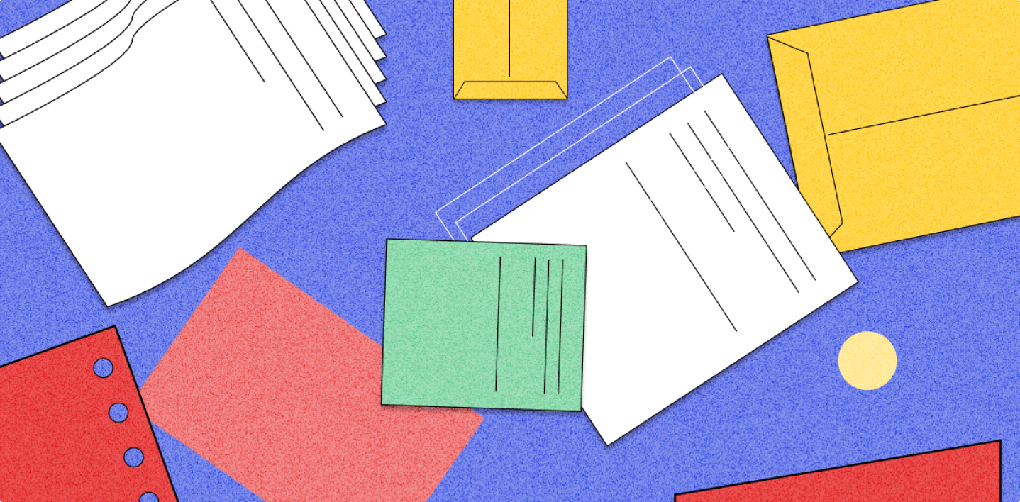
Standardizing article feature images
A lot of things influence design from typography, to content architecture as well as the use of colours and images. All these can draw a thin line between good and bad design. One important thing we were able to achieve is standardizing our article feature images. We wanted to make our featured images more intentional while achieving uniformity and consistency. Prior to the redesign, we had inconsistent illustration styles used for article cover images, so something we did was to come up with a single consistent illustration style across board for articles that will have cover images as illustrations.


Having a page outline on the article page
On the article page, we added a side nav that contains a page outline section. On the page outline, we display all the primary subheadings from the body of the article. This way, a reader is able to see all page subheadings at a glance and easily jump between sections if you’re searching for specific content.

Microinteractions & transitions
Micro-interactions and transitions generally enhance the user experience. They make static pages “feel alive”. Interactive design is something the web experience team is passionate about, and with the blog, we were able to add subtle transitions and micro-interactions to delight the reader.


Our approach to the redesign of the Flutterwave blog was somewhat new and different. The project served as a blank canvas for us to create something experimental, interactive, and functional, and the result is an experience we hope you enjoy.
Cheers to more beautiful experiences we will be creating in the future.
With love from the Flutterwave Design Team 🧡.