
Last year, we redesigned our Virtual cards experience on Barter. We gave our users a smoother experience of spending Dollars on their favourite sites.
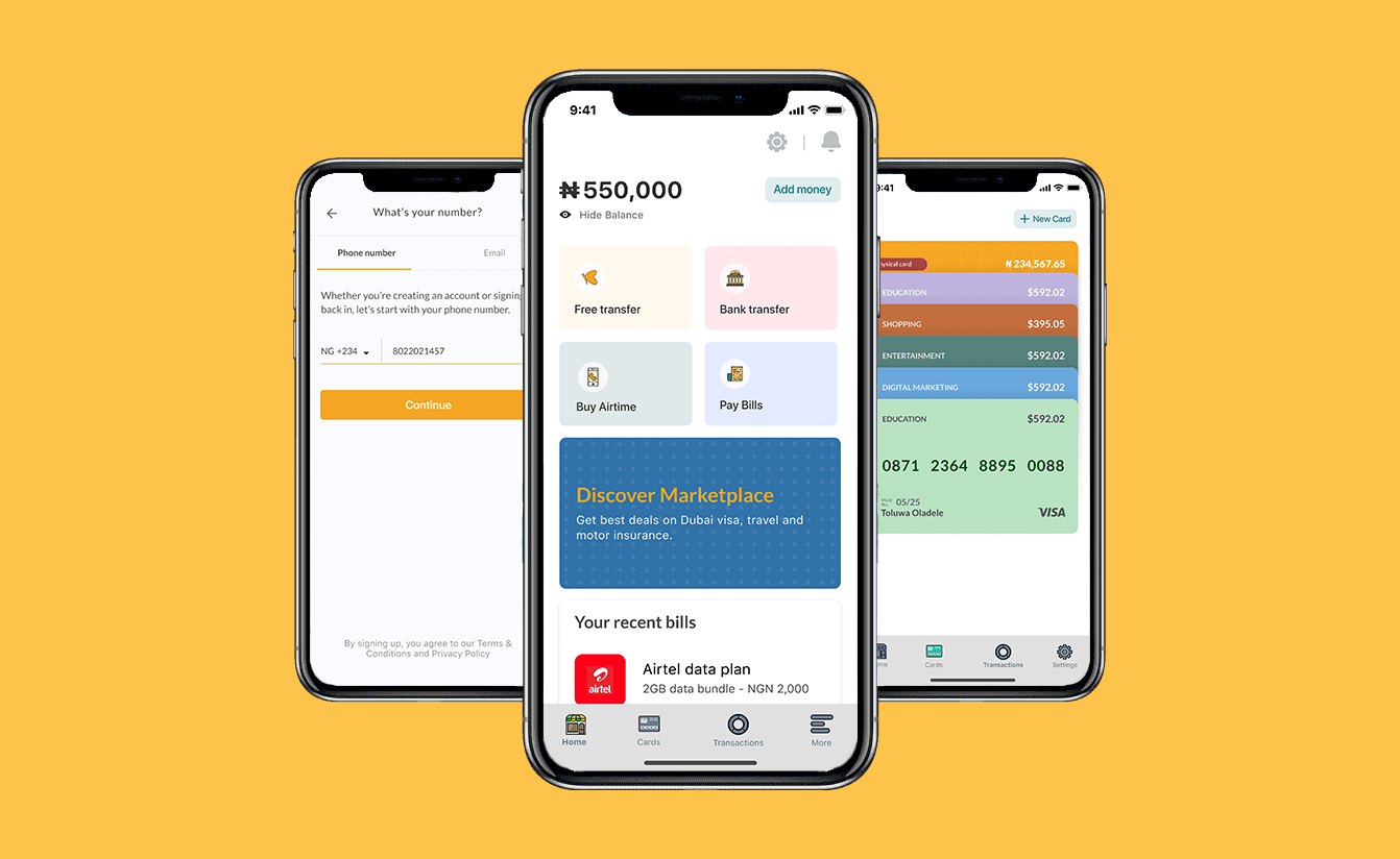
Barter is a financial product that helps you send and receive money from anywhere, using just a phone number. Barter also lets you create virtual dollar cards for online payments and purchases.
Earlier in the year, we realized that the virtual cards feature that a lot of our users downloaded the product for, had dropped in engagement, so we investigated to find out the main problems the users were facing.
Testing our assumptions
In addition to the feedback we received from our users, we planned, co-ordinated and conducted usability tests with new and existing users. We had them carry out specific tasks, while we observed them. We needed to understand exactly what was going on on their end.

From these feedback sessions, we got the following results:
Users don’t know how to create a Dollar card.
Users experience confusion when they want to create a new card.
Users can't find their cards easily
Users were unable to easily access their card details
We went ahead to narrow these results into three main challenges.
The first challenge
When a new user signs up on Barter, we create a default Naira card for them. This is the first card they see and it confuses them because they need Dollar cards. We experienced a lot of user drop-offs as a result of this.
")
The second challenge
To make a successful payment online using a dollar card, the user needs billing details of the card which Barter also provides. However, the card details could also be found on the same view, and this was not accessible knowledge to the users.
The third challenge
Funding and withdrawing from the Dollar card was a major challenge for the users as the buttons were hidden behind a switch action on the card.
")
Our goals
Reduce the drop-off rate after sign-ups by emphasizing the dollar cards.
Increase the number of active cards by:
making it easier to fund and withdraw
making billing details more accessible
Exploring viable solutions
The next step in the process was the conceptualization stage where we ideated and explored various ways to solve the problems in the lowest fidelity to enable us to decide which was the best direction to go.
After conceptualizing, we designed the necessary flows and interactions in detail to enable the engineers to start building the scoped solution.

The final solution we went with, was one that allowed the users swipe throught their cards to view them, having the primary actions like withdrawal, funding and card details, arranged at the bottom for accessibility and an ellipse button at the top right corner where the secondary actions were placed.
After this version was shipped, the rate of card deletion reduced massively because people no longer needed to delete their cards if they could withdraw their funds from it. We also experienced an increase in the value of dollars funded into cards because card funding action was no longer difficult to access.
Now things get more interesting…
After we had shipped this version of the redesign, we got new information from the users regarding the infinite scrolling action of the cards redesign. They found it difficult to create a new card because they were required to scroll for a long time to see the action. While this wasn’t a challenge we considered initially because most of our users had less than 3 active cards, we realized that there were a certain group of people who had appropriated Barter to fit their needs. This group include social media manager and Digital marketer who are required to possess multiple cards for the different client accounts they managed.
Again, we had a conversation with the users to gain more insights into the problems they were facing and their responses focused on these problems:
")
The fourth challenge
While Barter is a business to consumer product, some of its users had appropriated it to fit their business needs by having multiple cards for different clients/needs.
They faced issues with scrolling up to 13 times to see the “Create a new card” action.
To solve this, we explored different options, tested and iterated based on their feedback.

Finally, we went with this version that allows users to create new cards without swiping and well as easily differentiate their cards
")
")

Lessons learned on this journey
There were a number of lessons to take away from this project:
People want our products to deliver on the promises that we’ve made to them, so rather than focus on building futuristic features, we should focus on keeping even the simplest promise. This is what keeps them long enough to experience the future with us.
It’s important to seek out feedback early and continually.
Technical constraints are almost unavoidable and even when we have to work through it, we should optimize for a good user experience.
Sometimes the most innovative solution might not be the right solution. Consider the business needs as well as the user needs to understand where the big opportunities lie.12
Ultimately, by going through the different stages of this redesign, we were able to create a better ****user experience for all Barter users which was seen through an increase in positive reviews and a decrease in complaints regarding card sorting, funding, creation and general card management.