We’ve always wanted a space where we can write about things we’re working on, show a bunch of things that capture our interests, the several people that make up our design team, our diverse disciplines, as well as our team values. This resulted in the creation of the Flutterwave Design Website. In this article, we’ll cover the entire creative process involved from design to development.
The Design Process
Our approach to the design of the Flutterwave Design website was quite different from the norm, being that it was our design website, we had a high amount of creative freedom and we wanted to do something new, interactive, and experimental while still keeping it very functional and intuitive. Starting out, we pulled inspiration from a couple of design websites; Spotify Design, Airbnb Design, Dropbox Design, WeTransfer, and Ueno.
Some of the things we were looking to achieve on the project were:
An overall striking & memorable experience
A great reading experience
Beautiful imagery
Different background themes
Very fluid interactions and transitions
We had a total of six pages we needed to design;
The home page, which sets the tone of what the entire website is about
The stories page serves as a directory for all the articles we have written
The article page which is where you read the content we write
The vibes page is an image gallery that shows different things that capture our interests as a team ranging from images we own to really nice work of people we find on the internet.
The about page shows the different team members, our diverse disciplines, and team values
The events page where we show our friendly one-on-one sessions with different designers in our ecosystem, working on different products, either independently, or on teams.
Designing the home page
The home page was going to set precedence for how the rest of the site will look and feel. For the visual design, we wanted vibrant hues and tones, and lots of imagery. Our early explorations mostly revolved around a grid-style layout with visible borders. While it looked good, it wasn't giving off the vibe we wanted.


Quite frankly, we stumbled upon what was going to be the final design by accident. The inspiration came from our Twitter bio, which reads: Designing for FinTech, through the lens of our team. Lens was the word for us!
We decided to explore ideas revolving around reels, cameras, photography, gallery. We were the focal point, and the audience was our viewers. This worked like magic.

We fleshed this out some more, and instead of using individual cards as we did in the first version, we used a mask to hide the top and bottom of the cards, leaving only the center visible.

Designing the about page
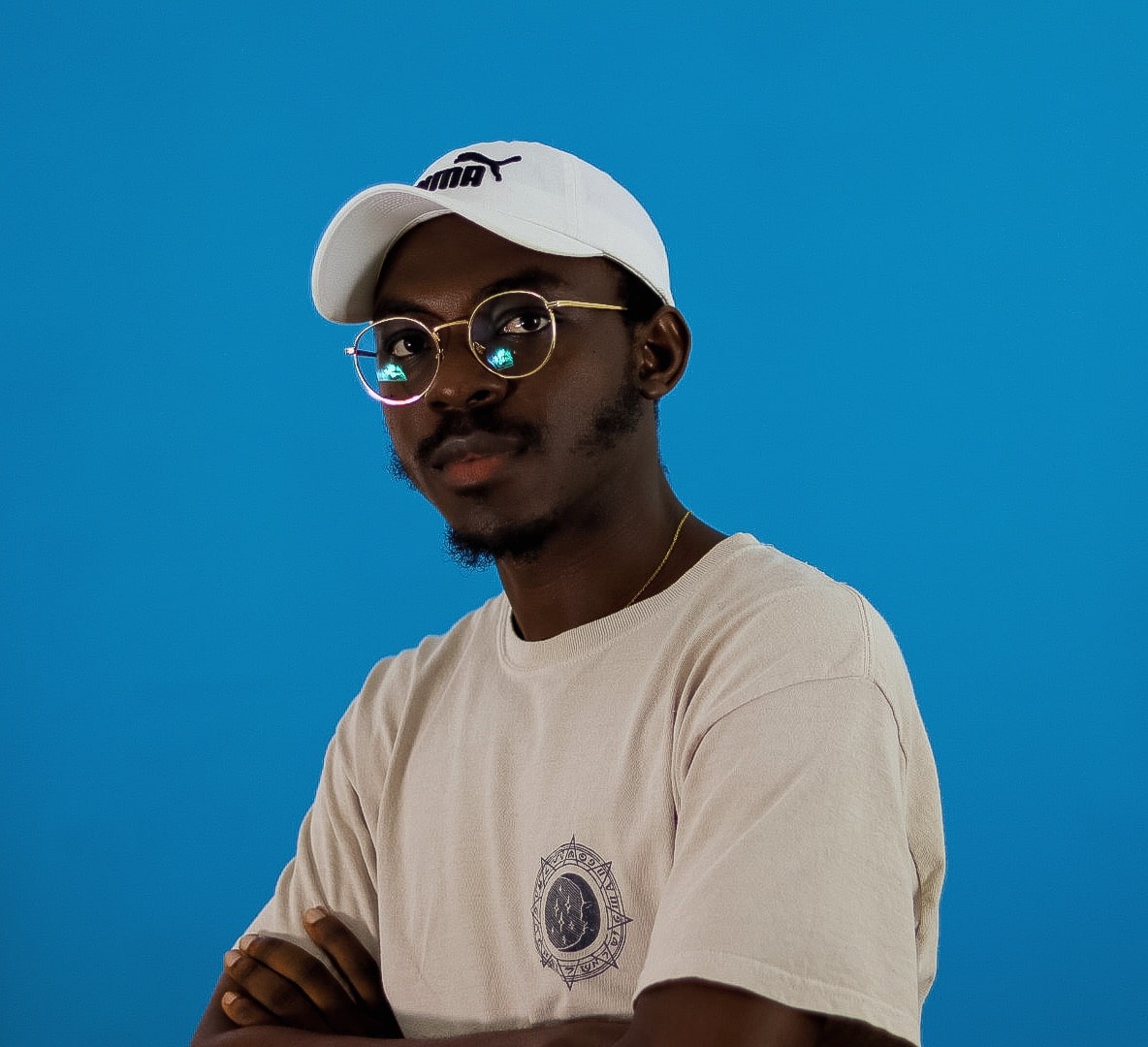
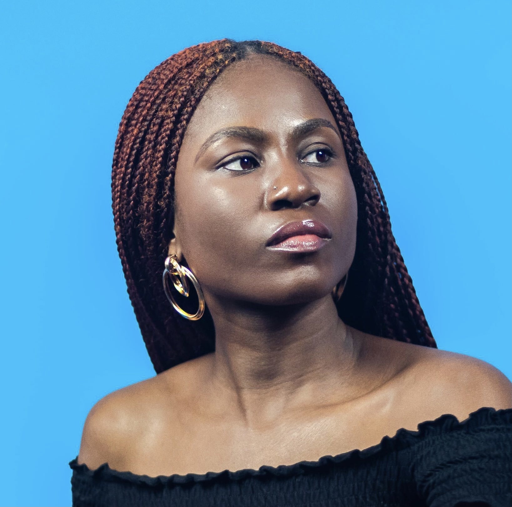
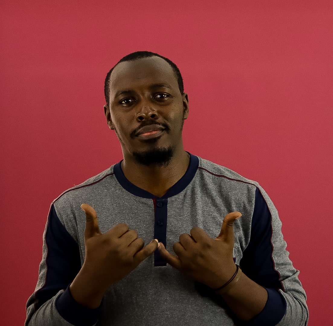
After the Homepage, the About page also gave us a lot of creative freedom to express our ideas. The major theme we wanted to explore for the team profile images was colorful and vibrant backgrounds. To achieve the vibrant profile backgrounds, we did our own in-house photoshoot and took several pictures before we picked the final photos.
The roll-around-wheel interaction was the most exciting thing on the page. The initial animation was prototyped in InVision Studio. This was achieved by having each picture in a container, with a mask to hide it in the entrance state. There’s also a master container (containers in inVision Studio work a bit like CSS containers or divs, they act as the parent, so the child respects the parent) that rotates full 360º which creates the spinning effect.


Illustrations
Knowing that most of the illustrations were going to sit on the about page, we were big on telling a story visually. Our execution involved the use of simple geometric shapes, a grainy texture, and an overall flat style. “Our disciplines” cards were illustrated to depict actual team members and what they do using visual cues from their respective disciplines.


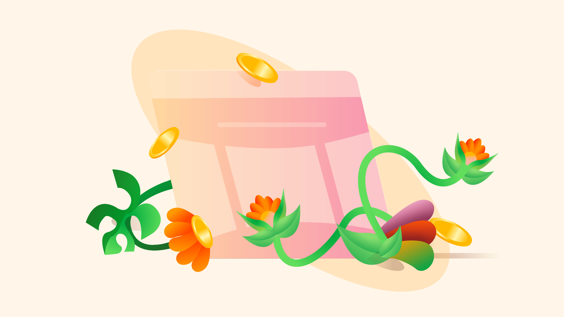
In the team, we work with certain values that serve to ensure that as a unit of the company we are frontiers of growth and innovation. The challenge was to visualize these values while maintaining a consistent look and feel. After thorough mind mapping to associate the team values with visual cues and concepts, we developed a creative direction.


The Creative direction was a metaphor of a garden. We imagined that all the work we do is in a garden, and we created scenarios that depict our values.


Different background themes
Earlier on when we redesigned our marketing blog, we experimented with different background themes and the dark mode was something new and experimental we introduced which greatly contributed to the visual aesthetics of the blog. We decided to try this same dark mode alongside the default light mode on this project as well, giving visitors the ability to choose their reading mode & overall theme preference.
Designing the article page
The article page is a crucial part of our design website as this is where you read the content we write, and it was super important to make sure this page provides a great reading and easy navigation experience.
The key things we were trying to achieve with the article page were;
A great layout structure, with the intention of also creating a great reading experience
Easy navigation between page content - The way to achieve this was to have a page outline section that highlights all the primary subheadings which are clickable links so a reader can quickly jump between sections
Featured image credit - Giving credit to the illustrator of the article’s cover image
Display author name, image, and role
Easy sharing of articles
For one of our iterations, we tried to set a background color in the hero section which is a light color shade picked from the article's cover image, but since we have two different background themes, we realized some color shades don’t work well on a dark background so we couldn’t go with this direction.

Also, we initially started designing with a wide article width but we soon realized that besides this not creating enough room for our article page outlines on the side, it also didn't translate to a great reading experience.

With our final iteration, we were able to satisfy all the key requirements we were trying to achieve with the article page.
Designing the vibes page
The idea of the vibes page was to have a place where we post images that capture our diverse interests as a team. The page highlights images we own and also interesting works of other people we find on the internet with proper referencing. The idea of the page was to post images with the name of the contributor, and for the work of other people, we make the images clickable links pointing to actual sources on the internet.

After our first iteration, we decided to go with a two-grid masonry layout because we believe it works better for landscape images and it also makes the entire page feel more like an online exhibition experience where you’re able to appreciate the images better.
Something important we later thought of was tagging the images with categories(photography, 3d design, architecture, etc) which gives more context to the interest of the individual team members. Also, for the work of other people that we reference, we thought it’d be super important to show their names as well.

Through these iterations, things we were able to achieve with the final result were;
A gallery of visually pleasing images that capture our interests as a team
By tagging the images, we personalized the interests, and a person who visits the site is able to get a sense of the general interests of team members
The page also serves as a source of inspiration for creatives
We’re also indirectly promoting interesting work of people we find on the internet
The last two key results weren’t the initial intentions but turned out as nice outcomes of the design process.
Logo Explorations
A logo is a crucial part of branding as this stands as a symbol of how a company or team is represented. We initially started with plain text for the logo and later on, inspired by the logo design of other companies’ design websites, we tried a couple of explorations.
The main reason we went with this logo direction was because the butterfly is a strong symbol people identify Flutterwave with, and this makes it straight-up easy for people to identify the design team with the company.
The Development Process
We knew what we were building was going to be very interactive and would also require a CMS for managing content that we will be putting up on the site(articles, vibes, events…). The frontend framework we used to build this site is Nuxt.js which is a framework based on Vue.js.
The site at the moment doesn’t run as an application, instead, we’re generating static pages which makes it faster to load. Nuxt currently supports static site generation which includes generating dynamic routes straight out of the box. For static pages generation and deployment to our production URL, we’re using a build hook, which ties our git repository to our CMS, so whenever a new article is written for example, it’s able to use the hook to trigger a build in our pipeline that eventually deploys to the production URL.
Third-party libraries
Third-party libraries we used are vue-flickity and @appnest/masonry-layout, which are pretty lightweight. We initially started writing our own custom code for the masonry layout on the vibes page but the image placement logic wasn’t always accurate so we later opted for @appnest/masonry-layout, which is a very lightweight library to achieve a masonry layout.
CMS Frameworks we used
For this project, we knew our choice of CMS was going to be a headless one. A headless content management system is basically a back-end-only content management system that acts primarily as a content repository and makes content accessible via an API.
We read up on a couple of headless CMS’ and started out with Strapi, and for the most part it seemed fine for what we were trying to build, but later on, we had a few issues with the CMS, a major one being that the rich text editor wasn’t robust enough for what we wanted to achieve, so we switched to Contentful which was more tailored to what we were trying to achieve.
Animations, interactions, and transitions
Building interactive experiences can be tricky depending on the depth of the animation logic. Implementing animations & transitions at its core majorly involves writing mathematical functions, and to always achieve an accurate outcome, the calculations that make up the logic always have to be correct. We were keen on making sure the entire animation of the site feels very fluid, and without lags.

We achieved the animations and transitions on the site by writing our custom animation code without using any third-party animation library, the main reason for this was to keep the site as light as possible.
For the animations and transitions, it was a mix of writing CSS(SCSS) animations coupled with writing Javascript to achieve some others we couldn’t totally achieve with pure CSS. A lot of the CSS animations involved using CSS variables coupled with SASS variables, SASS lists, functions, and conditionals. We also adopted an animation ease function used across board throughout the entire site.

Some of the major, really interesting animations we achieved were with the about page team carousel & value cards as well as the home page hero carousel. Besides the major animations, there were also a few other subtle animations we did, one of them being the implementation of our own custom cursor. We also had this initial idea of a progress bar at the top of the article page that shows the reader’s progress on the article which was based on a linear interpolation logic. We started the implementation but it didn’t go live, it’s a nice-to-have we will probably roll out later on as an update.
We had fun building the Flutterwave Design website. Besides the website representing our home on the internet, it also served as a playground to unleash our creativity as a team, and the result was a beautiful & interactive experience.
Cheers to more beautiful experiences we’ll be creating in the future.
With love from the Flutterwave Design Team 🧡